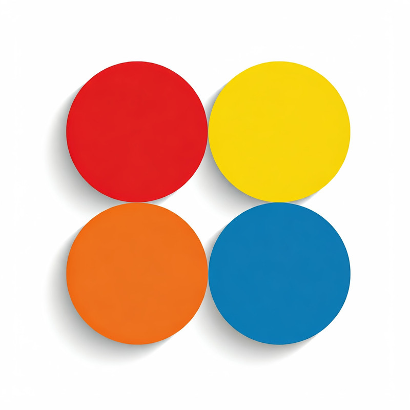
Color is an essential element of design, influencing emotions, perceptions, and visual appeal. Whether you are designing a website, painting a room, or creating marketing materials, understanding color schemes can help ensure your work is visually harmonious and effective. In this article, we’ll explore the four main color schemes—Monochromatic, Analogous, Complementary, and Triadic—and explain how each can be used to create striking designs. www.clariss.xyz generates color palettes in all four color schemes.
1. Monochromatic Color Scheme
A monochromatic color scheme uses different shades, tones, and tints of a single color. This scheme provides a cohesive and minimalist appearance by varying the intensity of one hue to create depth and interest.
Characteristics:
- Hue variations: A single base color is adjusted with black (to create shades), white (to create tints), or gray (to create tones).
- Low contrast: Because it uses only one hue, there is less contrast than in other schemes. However, this also results in a serene and uniform design.
- Simple and clean: It’s easy to balance and can create a sophisticated or calming look.
Where to Use It:
- Branding: Monochromatic schemes are ideal for brands aiming for a clean, elegant, or professional feel.
- Minimalist designs: This scheme works well in minimalist designs where you want to avoid visual clutter.
- Interior design: Monochromatic colors can create a calm, relaxing atmosphere in homes and offices.
Example:
Using different shades of blue can create a soothing and professional design. Lighter tints can be used for highlights, while darker shades add depth and focus to key elements.
2. Analogous Color Scheme
An analogous color scheme consists of three colors that sit next to each other on the color wheel. These colors share a similar hue, which makes them harmonious and pleasing to the eye.
Characteristics:
- Natural harmony: The colors blend naturally together, often mimicking the hues found in nature (e.g., the changing colors of the sky at sunset).
- Low contrast: Like the monochromatic scheme, analogous colors have low contrast, but the slight variation adds more interest.
- Easy to balance: The colors are close enough in hue that they work well together without clashing.
Where to Use It:
- Nature-inspired designs: This scheme is perfect for evoking natural, calming, or serene atmospheres.
- Soft transitions: Use analogous schemes in designs where you want smooth transitions, like in gradients or backgrounds.
- Branding: Analogous colors work well in branding when you want to convey harmony and unity.
Example:
A color palette that includes green, yellow-green, and yellow will feel harmonious and reminiscent of nature. This combination is ideal for eco-friendly brands or websites that emphasize sustainability.
3. Complementary Color Scheme
A complementary color scheme uses two colors that are opposite each other on the color wheel. These contrasting colors make each other stand out, creating a vibrant and eye-catching design.
Characteristics:
- High contrast: Complementary colors provide a strong contrast, making each color more vibrant when placed side by side.
- Bold and dynamic: This scheme can create energetic and attention-grabbing visuals.
- Challenging to balance: Because of the high contrast, it can be tricky to balance a complementary scheme without one color overpowering the other.
Where to Use It:
- Call to action: The contrast is perfect for buttons, banners, or any other design element that you want to stand out.
- Logos and branding: Complementary colors are commonly used in logos to make them pop.
- Sports and entertainment: The boldness of complementary schemes is often seen in sports team uniforms and entertainment branding.
Example:
Using red and green together creates a strong contrast. While this might remind some people of holiday colors, adjusting the shades can make it suitable for other uses—like pairing muted red with olive green for a more modern look.
4. Triadic Color Scheme
A triadic color scheme involves three colors that are evenly spaced around the color wheel. This scheme is both balanced and vibrant, offering more variety than monochromatic or analogous schemes without the high contrast of complementary colors.
Characteristics:
- Balanced contrast: Each of the three colors contrasts with the others but is balanced, leading to a dynamic yet harmonious look.
- Vivid and colorful: Triadic schemes are more colorful, making them ideal for playful or bold designs.
- Requires thoughtful balance: While all three colors have equal visual weight, one should be dominant, with the others used as accents to avoid an overwhelming design.
Where to Use It:
- Youthful or playful designs: Triadic color schemes are often used in designs that target younger audiences, as they are visually stimulating.
- Art and fashion: This scheme allows for creativity while maintaining visual harmony.
- Web design: Triadic schemes are great for websites that want to incorporate color in a balanced way, without appearing too stark or too muted.
Example:
A triadic scheme using red, yellow, and blue creates a bold, primary color palette. Adjusting the saturation or brightness of each color can create a more modern or muted effect.
Conclusion
Understanding the four main color schemes—monochromatic, analogous, complementary, and triadic—provides a solid foundation for creating designs that are visually appealing and effective. Each scheme has its strengths, from the simplicity of monochromatic schemes to the boldness of complementary colors. Choosing the right color scheme for your project depends on the message you want to convey and the emotions you want to evoke. By mastering these color schemes, you can create designs that not only look good but also resonate with your audience.
