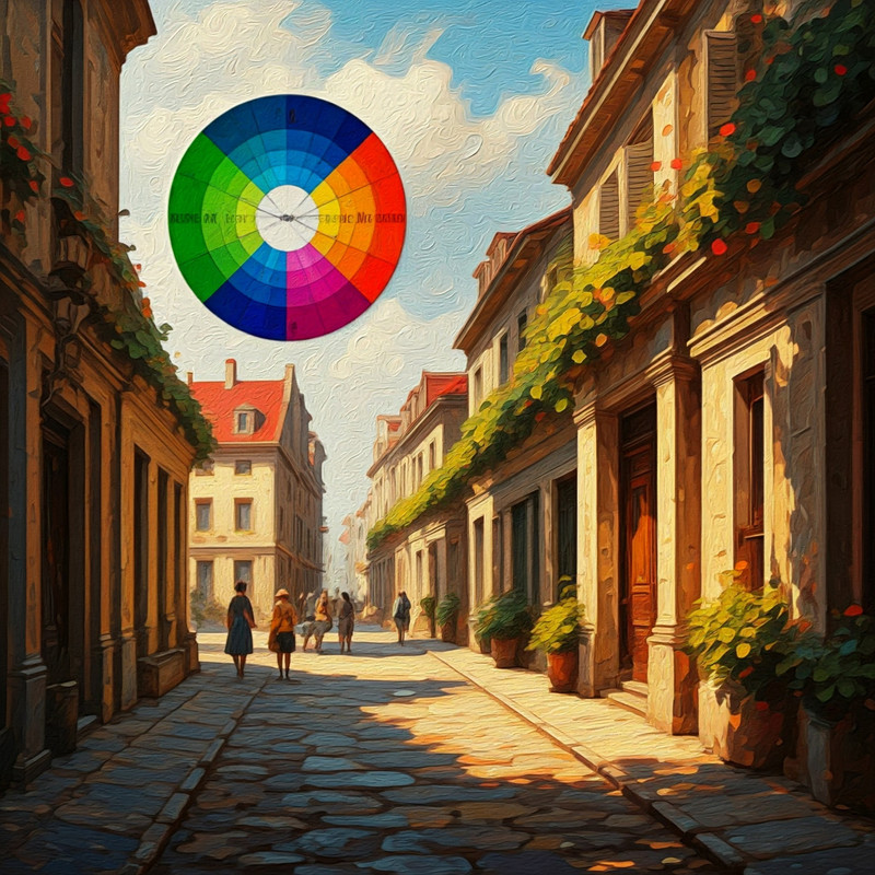
In the world of color theory, few concepts are as impactful and visually striking as the complementary color scheme. This color scheme, built on the relationship between colors that sit opposite each other on the color wheel, is known for creating bold contrasts and dynamic visuals. From graphic design to fashion and interior decor, complementary color schemes have been used for centuries to evoke emotion, guide focus, and add depth to creative work.
In this article, we’ll explore what complementary colors are, how they work together, and how you can effectively use them in design to achieve visually stunning results.
You can create complementary color scheme palettes from images, a list of 700+ color names, or hex code inputs on Clariss.
What Are Complementary Colors?
Complementary colors are pairs of colors that, when placed next to each other, create the strongest contrast and can make each other appear more vibrant. On the traditional color wheel, complementary colors are located directly across from one another. These color pairings naturally provide balance, as they consist of one warm color and one cool color. Together, they create a visually appealing contrast that can draw attention or establish a sense of harmony in design.
Here are the primary complementary color pairs:
- Red and Green
- Blue and Orange
- Yellow and Purple
The Science Behind Complementary Colors
The reason complementary colors work so well together lies in how the human eye processes color. When we look at a color for an extended time, our eyes become fatigued by that color and create an afterimage of its complement. For example, if you stare at a red object for long enough, you'll eventually see a faint green afterimage. When you place two complementary colors next to each other, this natural optical effect enhances their vibrancy, creating a powerful, attention-grabbing contrast.
Examples of Complementary Color Pairings
- FAD6A5 and #05295A
- #FF8C00 and #0073FF
- #FF00FF and #00FF00
Using Complementary Colors in Design
1. Graphic and Web Design
In graphic and web design, complementary color schemes are frequently used to create emphasis and highlight key elements. For example, a designer might use a predominantly blue background and apply orange for buttons or call-to-action elements to draw the user's attention.
Tips:
- Use one color as the dominant hue and the other as an accent to avoid overwhelming the viewer.
- Be mindful of brightness and saturation. High saturation on both colors can be too intense, so you may want to tone down one color to achieve a more balanced look.
2. Interior Design
Complementary color schemes are also popular in interior design. Using complementary colors in a room can create a dynamic yet harmonious look. For example, a living room with soft blue walls can be brightened with orange throw pillows, artwork, or rugs, providing a lively contrast without being overbearing.
Tips:
- Use complementary colors in different shades and tones to create a sophisticated palette. For instance, you can experiment with terracotta and navy instead of pure orange and blue.
- Avoid using complementary colors in equal proportions. A balanced design typically has one dominant color and its complement used sparingly as an accent.
3. Fashion
In fashion, complementary colors can be used to create bold and eye-catching outfits. Pairing colors like yellow and purple or blue and orange can make an outfit stand out, especially when accessorized creatively.
Tips:
- Complementary colors work well when one is muted while the other is more vibrant.
- You can use a complementary color pairing in patterns or prints to make a statement without it becoming overwhelming.
Advantages and Disadvantages of Complementary Color Schemes
Advantages:
- Vibrancy and Contrast: Complementary colors are naturally eye-catching and dynamic, making them ideal for creating strong focal points.
- Balance: The warm-cool balance of complementary colors can create a harmonious design when used correctly.
Disadvantages:
- Overwhelming: Using complementary colors in equal amounts or with high saturation can become visually overwhelming, causing strain for the viewer.
- Challenging to Balance: Achieving the right balance between complementary colors requires careful attention to tone and proportion to avoid clashes.
Conclusion
The complementary color scheme is a powerful tool in design, offering a perfect balance between contrast and harmony. Whether you're designing a website, decorating a room, or putting together an outfit, understanding how complementary colors work can help you create visually striking compositions that are both balanced and engaging. By mastering the art of pairing opposites, you can harness the vibrancy and boldness that complementary colors bring to any project.
